footigo MOHRE veylinks g2e tadbeer

Establishing a knowledge-based economy

MOHRE
The Ministry of Human Resources and Emiratisation (MOHRE) applies a strategic plan that seeks to transform the job market in the UAE into an empowering attractive market for Emirati talents. This represents a roadmap in managing manpower in the UAE to reach a new phase of development and establish a knowledge-based economy according to UAE Vision 2021.
Year
2016 - 2020
platforM
• Web
• iOS
• Android
problem
The ministry provides 100+ governmental services that help businesses handle their day to day operations, However, users are not aware of many of these services. Additionally the app structure and the UI was quite complex for users.
responsabilities
• UX Research
• UI Design
• Web Design
• Interaction Design
The Goal
I was responsible for user research, the redesign process and I was the team lead for this particular project. I led the team through the initial meetings with management, design workshops to the presentation of the final design, all with the goal in mind:
  • Redesigning the full app with usability in mind
  • Creating a Design System allowing designers, developers and QA's to be on the same page
  • Onboarding the user regarding new app features
  • Enhancing the service application experience
Results
Redesigning the app, resulted in the Ministry being awarded 1st place for the "Best m-Government Service Award". The new design provides users with the ability to:
  • Customize their experience by prioritizing section on the home page
  • Apply for service quickly by minimizing the steps
  • Book a ticket on the way to the service center
  • Manage transactions quickly and easily

User Segmentation

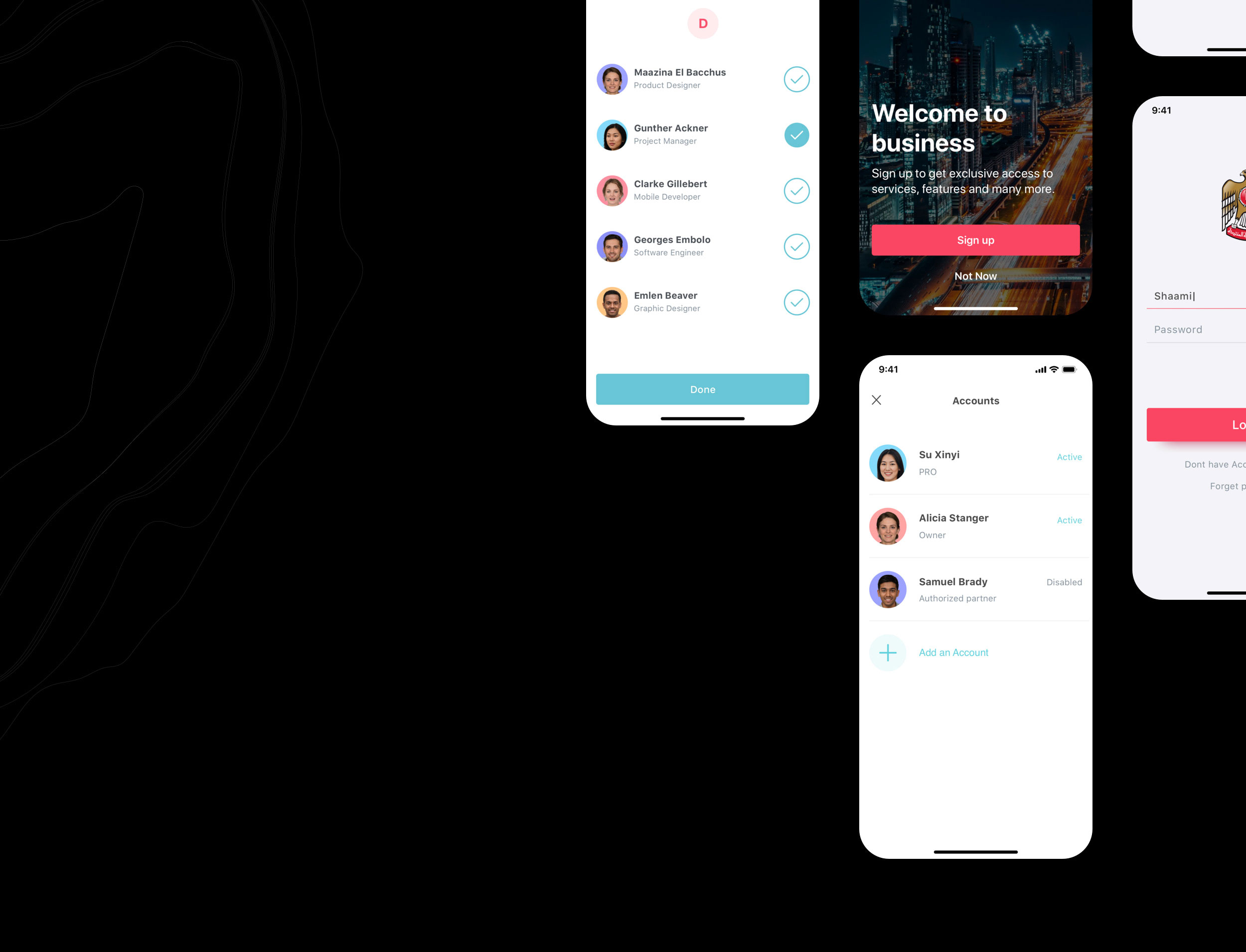
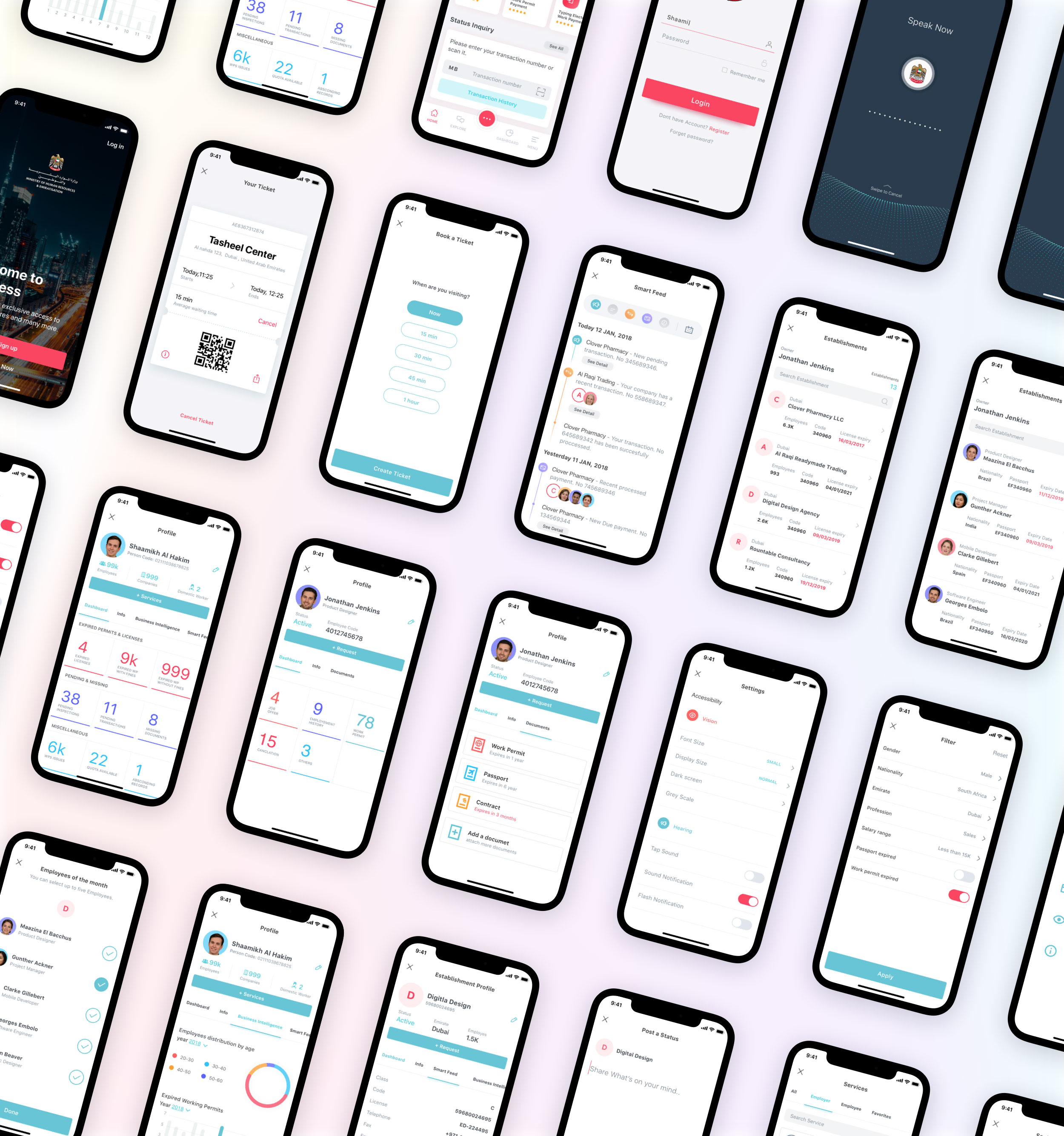
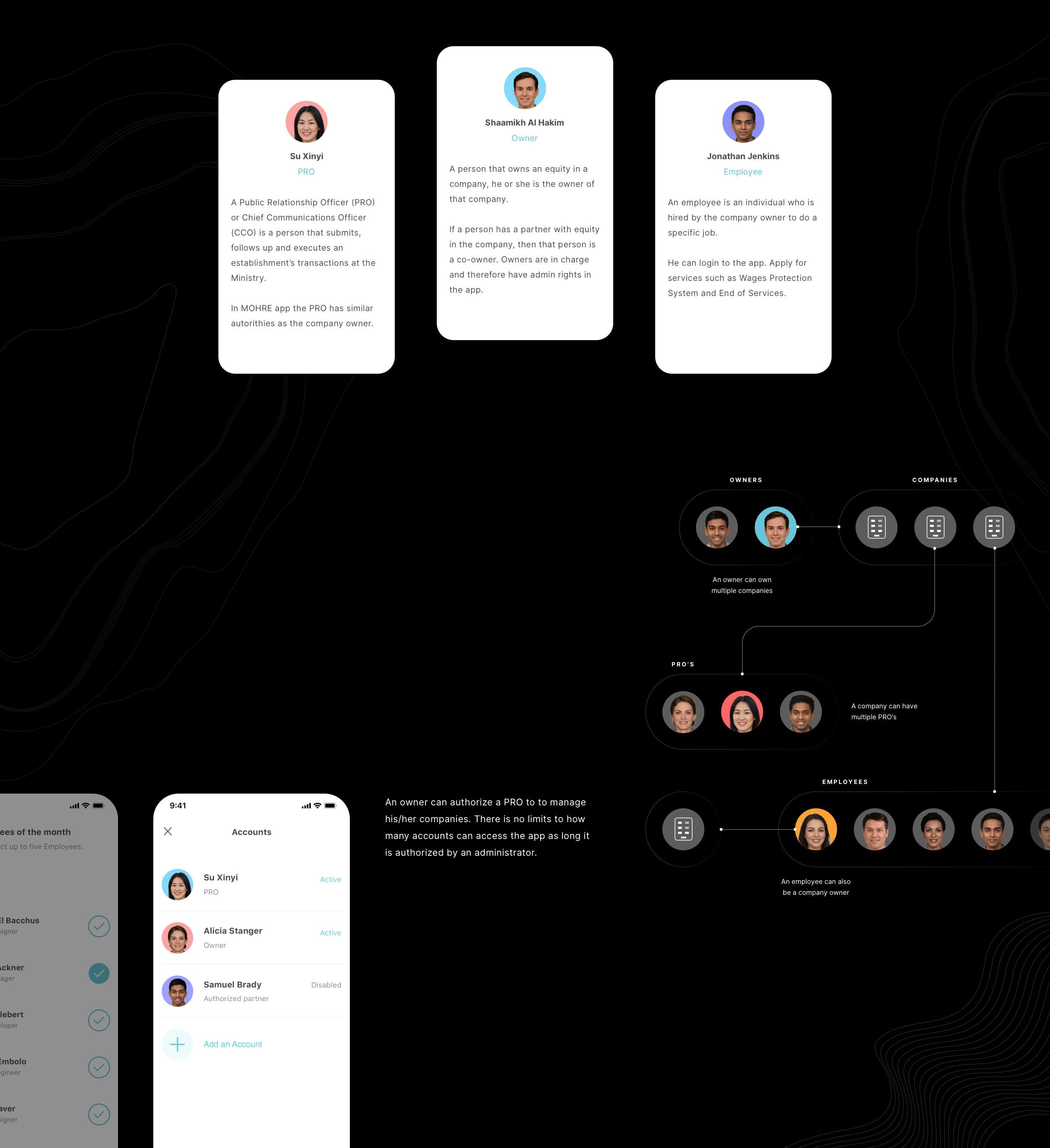
We knew who our three users were and researched what their daily work routine was like and what needs they had. We aimed to enhance one user experience without affecting the the other user's experience. The app consists of three main users, Owner, Employee and PRO:

The Biggest Challenge

In the previous application, applying for a service was confusing. The app structure was complex for users, Accessing the service was no easy task. You apply from the home page, company list or employee list. While these are relevant cases it was hard for the user to understand how it worked.

Visual Reduction Was Key 

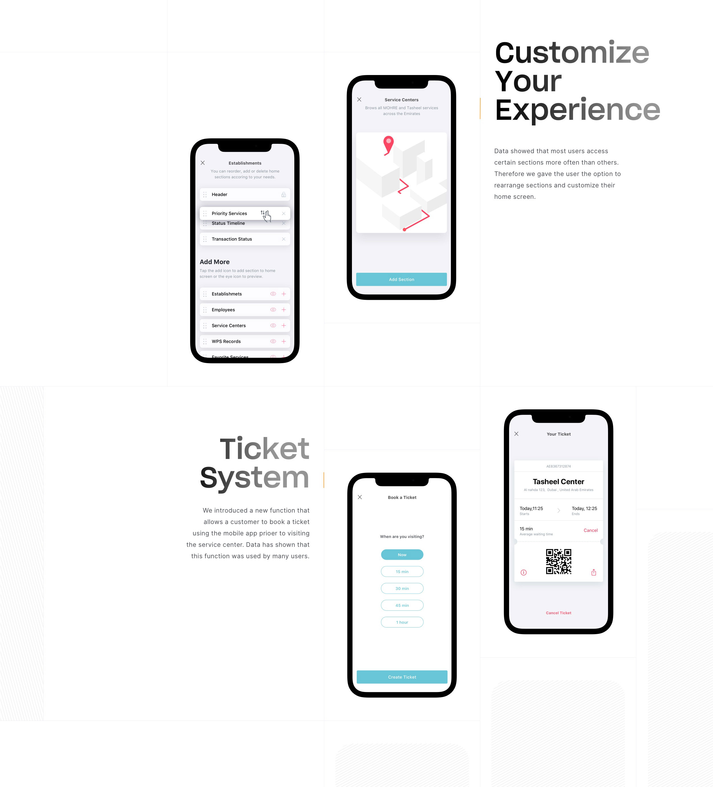
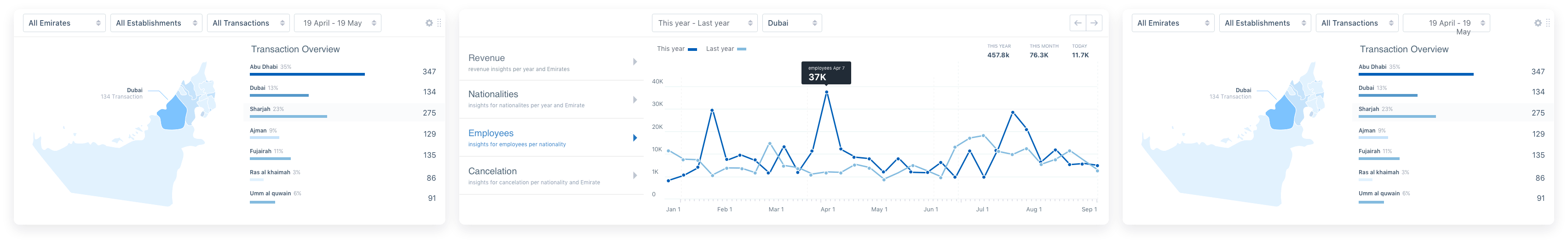
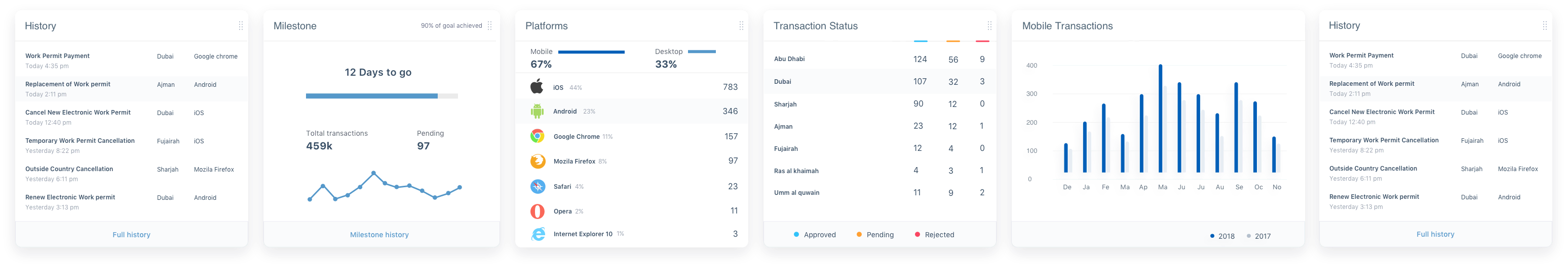
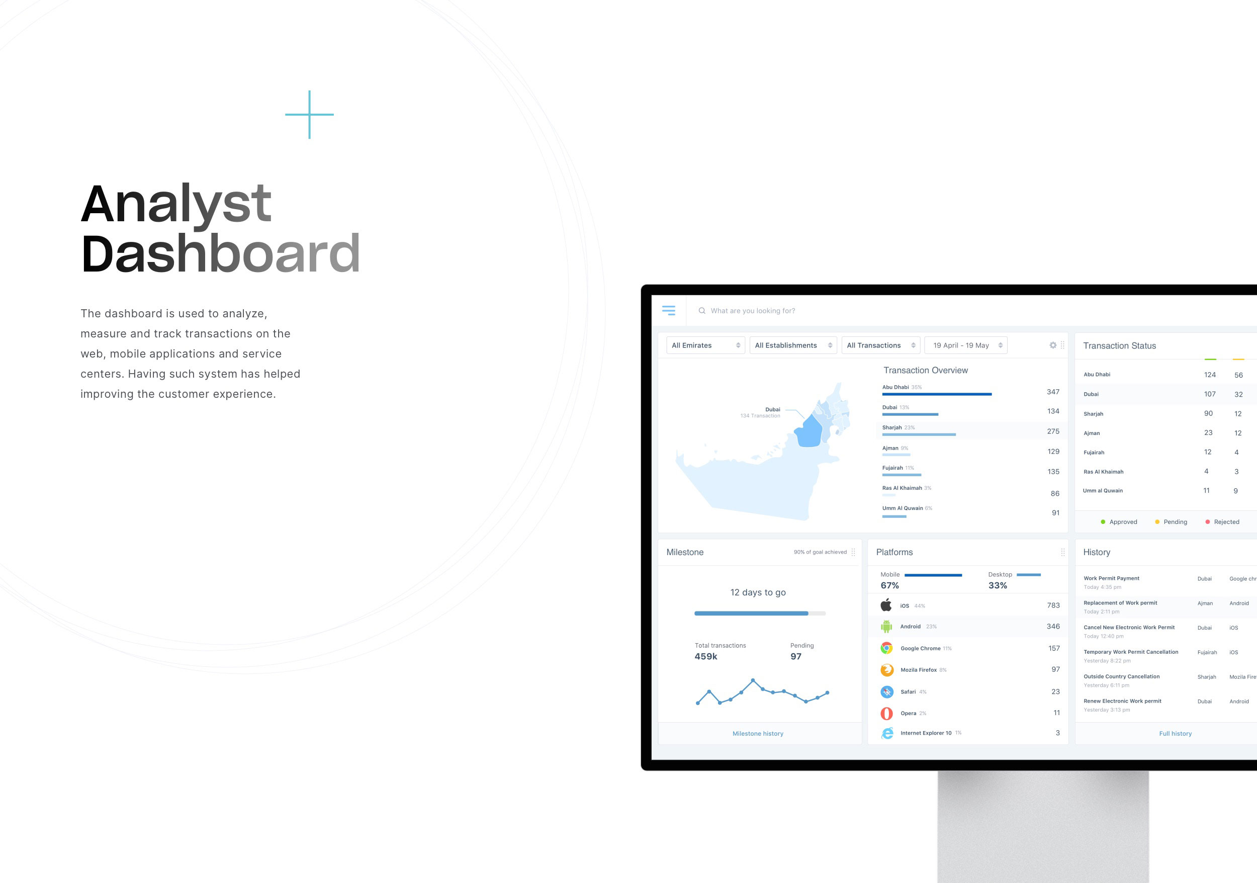
The aim was to have an overview of the available services for which he/she can apply and to reduce the steps to avail a service to a minimum. To achieve this we proceeded as follows:

Services

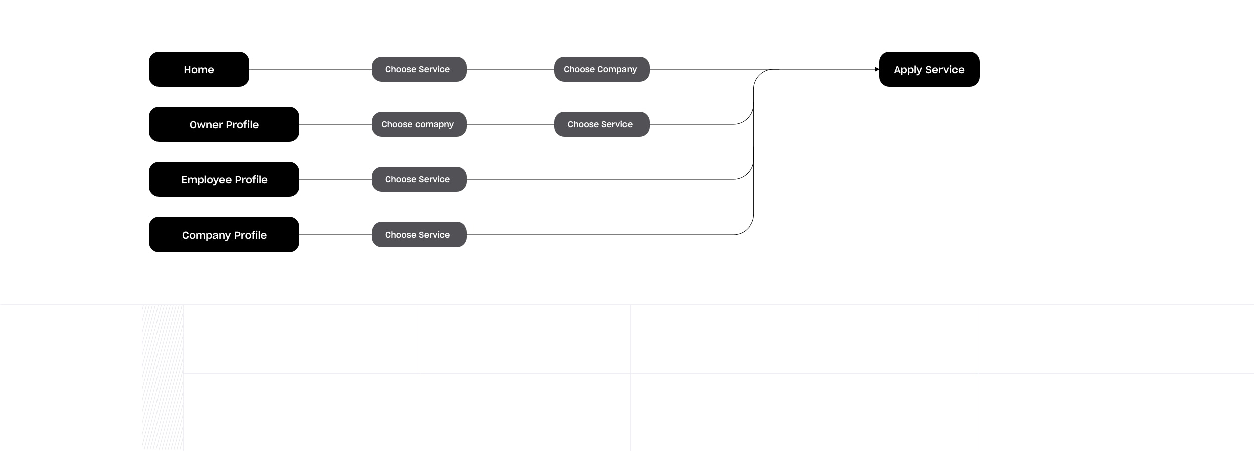
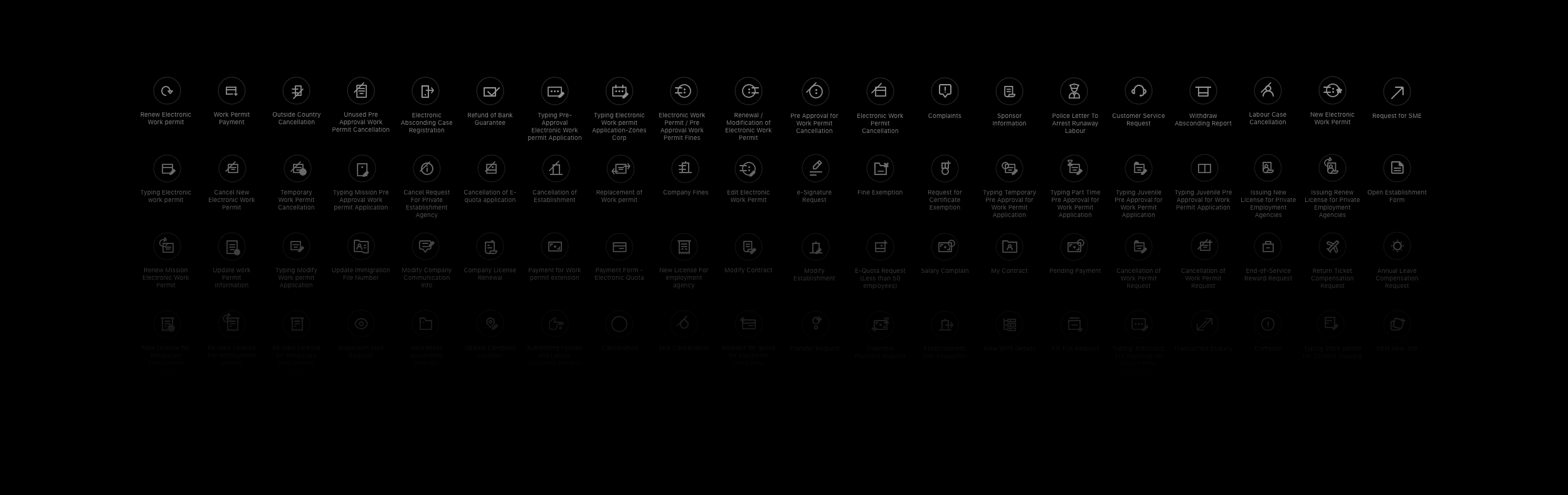
Services are the building blocks of the app. It allows the user to apply for different requests with the goal of increasing efficiency, flexibility, and productivity in the business, conforming to international standards and conventions in the field of work and labour organization. There are different services for each user type.

Results

Results
Redesigning the app, resulted in the Ministry being awarded 1st place for the "Best m-Government Service Award". The new design provides users with the ability to:
  • Customize their experience by prioritizing section on the home page
  • Apply for service quickly by minimizing the steps
  • Book a ticket on the way to the service center
  • Manage transactions quickly and easily